Three Tips For Photographers New To The Gridspace Theme On WordPress

To save you time, this post is written for photographers using or interested in using the WordPress theme Gridspace. If you don’t use Gridspace and don’t have plans to, feel free to leave this post now and move on to whatever it is you have to do next! But, as always, thanks for visiting!
Yesterday, I posted about the recent switch I made to Gridspace for my photography site.
I’m posting briefly today as a follow-up to that post. I want to share a few tips that might help any of you photographers who are using Gridspace or who might be interested in doing so. I love WordPress. This is my way of “giving back!” Hope it helps you!
1) I think photography is best enhanced by a black background. With Gridspace, a user can select a black background through the customized settings. So, where “>” means “go to and click on/select”:
>dashboard>customize>theme options>select a theme style>black
(A slightly longer but maybe more familiar route is:
>dashboard>appearance>customize>theme options>select a theme style>black)
2) If your images don’t show in the squares on the grid, i.e. you have some dark gray grid squares, try this:
For old posts that you’ve migrated from another WordPress theme to Gridspace:
>dashboard>posts>all posts>select “edit” for the post you want to fix>set featured image (you might have to scroll down your page to find this setting, and once you select it, it will take you to the media library)>find and select the post image from the media library>set featured image>UPDATE (This is important! You have to update your post after every change, including this one!)
For all new posts, I plan to “set featured image” as I create each post to that site. So, once my post is complete, from my “new post” page, I’ll:
>set featured image (you might have to scroll down your page to find this setting)>find and select the image from the media library>set featured image>UPDATE or PUBLISH
3) to reduce the empty space within the grid, that is the area that is solid black and appears as if grid squares should fill it:
>dashboard>settings>readings>”Blog pages show at most” – set to 9 or 12 to make the layout multiples of 3 (if you are using a 3 column grid)>SAVE CHANGES (This is essential to capture this setting or any others on this page! Scroll to the bottom of the page to find the Save Changes button.)
I found these tips and more at the wordpress.org forum page for Gridspace.
I hope this is a help to those of you using Gridspace. These were the three immediate things I needed to resolve when I first migrated TheRipestPics to the Gridspace theme.
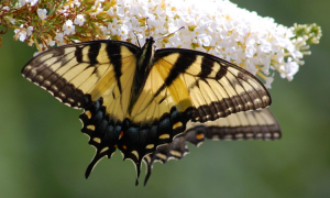
Here’s a glimpse of how the Gridspace theme highlights my photographs. I love it.

Update: I have since changed the layout of my photo site to “square” and I think it better showcases my photographs. It’s a two-column, square thumbnail grid, allowing more space for each image. To choose from three layout options in this theme (including “square”), here’s what you do:
>dashboard>appearance>customize>theme options>thumbnail orientation>(choose vertical, square, or horizontal)
With square, it will look like this:

Gridspace theme in customized “square” thumbnail orientation